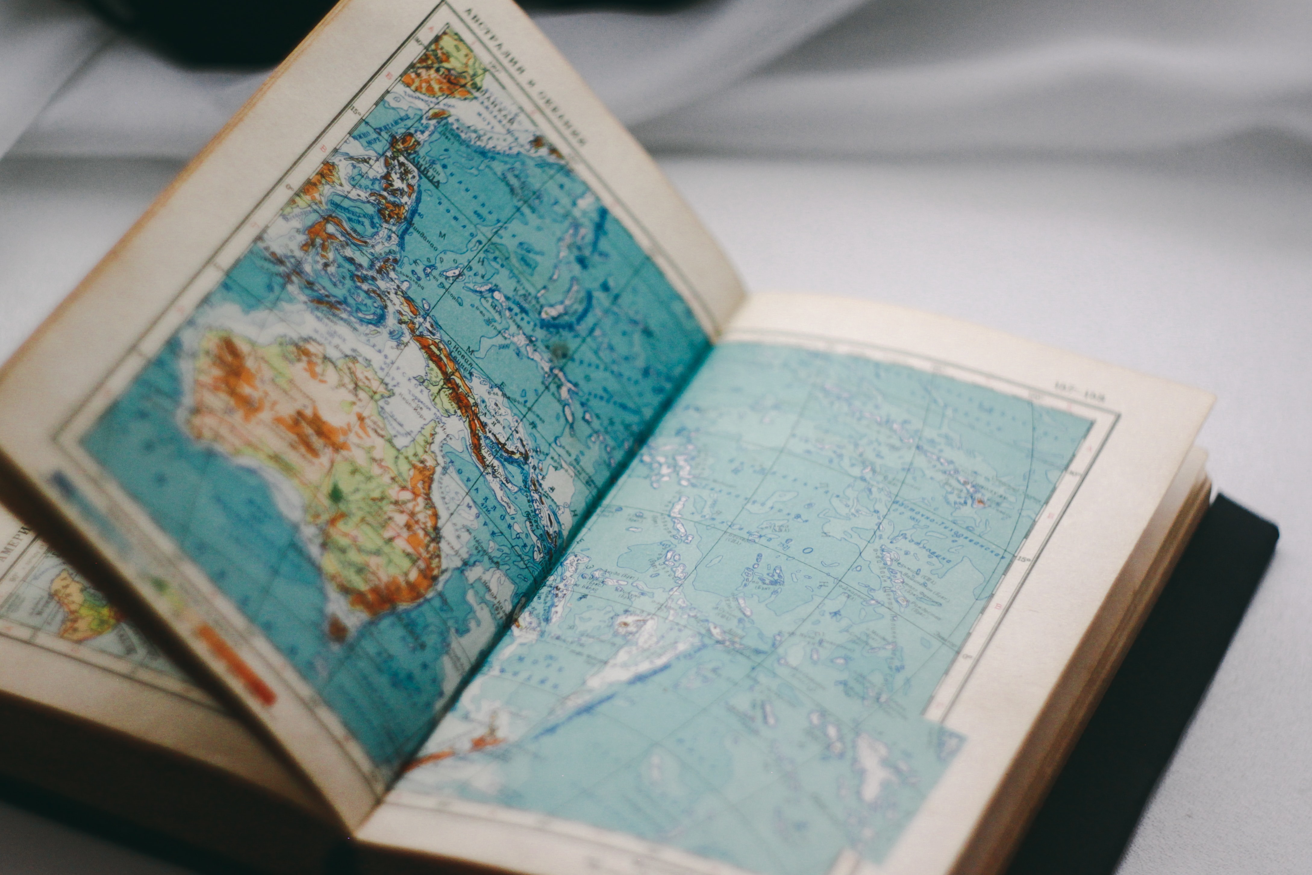
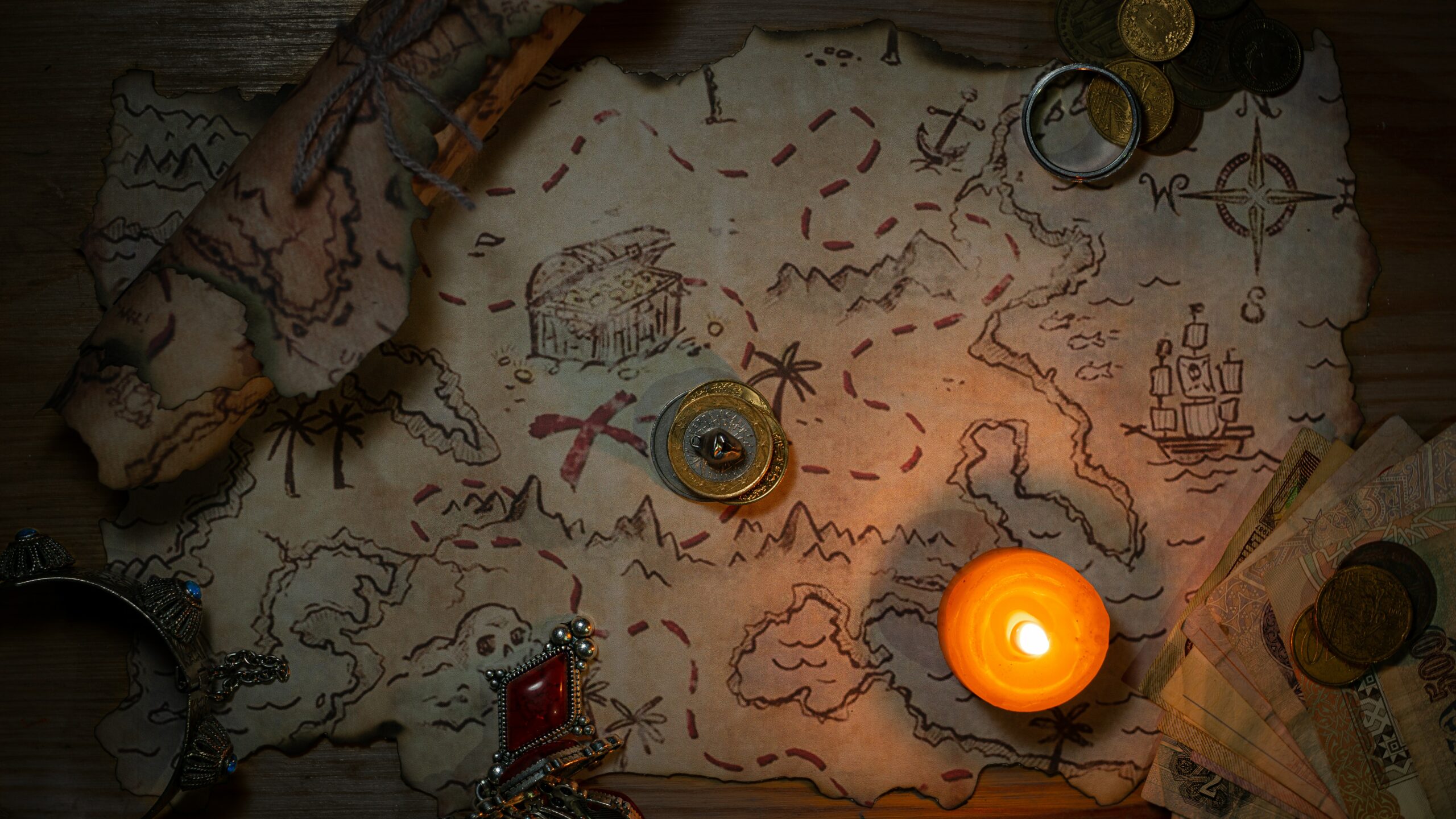
Why are geographical maps needed?
The ancient Greek scholar Ptolemy, in his famous Handbook of Geography, taught that a map ‘With mathematics we can cover the whole earth in a single picture’. Orientation, plotting your route, seeing the world beyond the horizon and simply looking at what a map of south england looks like, a map helps with all of this. A map is a small model of the world, and modelling is one of the key methods for learning about the world around us. It is hard to find any field of knowledge that cannot benefit from cartography: maps are used to record and analyse research findings, to generalise, to find patterns, to test hypotheses and make predictions. Cartography has given the earth sciences a universal language, a common method of knowledge.

Legends of maps.
Over time, certain norms, rules and traditions have been established in choosing appropriate symbols and methods of representation for various purposes. However, as these rules are not very strict, each map should also have a legend to explain the meaning of all symbols.
Cartographic symbols
Mapping symbols may be divided into three groups: point, line and area symbols. Dots are simply dots on the map that can be used to mark an oil rig, a landmark or a populated area. The dot marks the location but says nothing about the size of the site. Linear signs indicate rivers, roads, boundaries, tectonic faults and other features about which it is important to know their location and extent. Area signs, consisting of contour and fill, refer to mountains, forests, lakes, animal and plant habitats, and other features that are important to know their location, size, and outline.
What are some ways to depict maps?
As the objects, phenomena, and processes that are mapped vary in their properties, there is a whole system of mapping techniques. For example, the movements of atmospheric masses, the directions of sea currents, and the migration routes of animals are indicated by certain movement signs. Isolines connect points with the same values of atmospheric pressure, temperature, altitude, etc. The map may contain graphs (charts) describing the dynamics of a particular process and visual icons (pictograms) resembling the object being depicted, for example an aeroplane marking an airfield. The main thing is, as the German philosopher and mathematician Leibniz said, “care should be taken to make the signs easy to discover”.
What is the scale of a map?
A map is a reduced representation of a section of the earth’s surface. How much it is reduced indicates the scale – a number equal to the ratio of the length of the lines on the map to their actual length. For example, if it is indicated that the map is drawn at a scale of 1 : 20 000 000, it means that 1 cm on the map corresponds to 200 km (i.e. 20 000 000 cm) on the ground. The way of representing the scale as a fraction is called a numerical scale. The scale can be represented as a ruler divided into units of length (centimetres, millimetres) corresponding to metres or kilometres on the ground – this method is called linear. Or it can be written: 1 cm is 1 m, thus indicating a named scale. The scale of maps can be small-scale, medium-scale or large-scale. As a rule, the larger the scale, the more detailed the map.


